AUTOMATION
NEWS CENTER
A3 had plenty of content.
It didn't have one place to understand it.
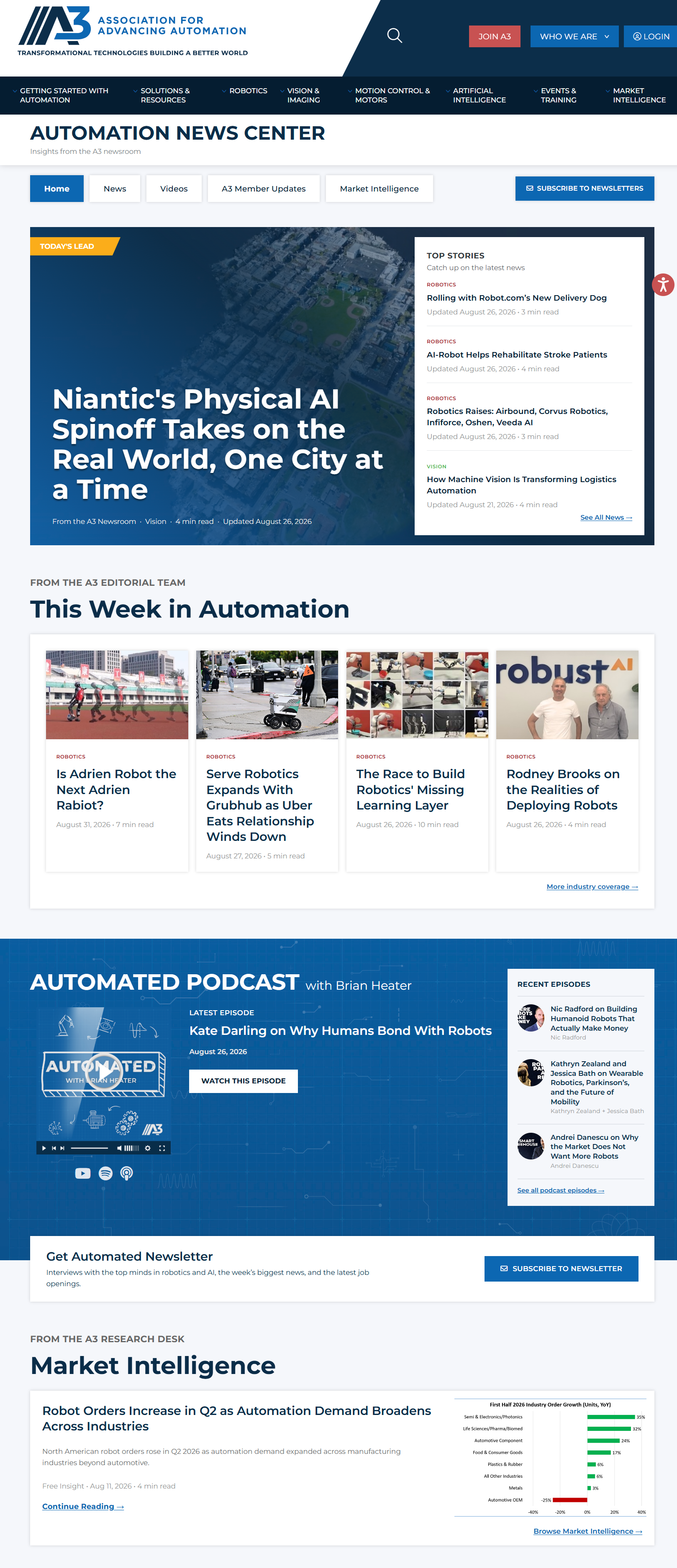
I restructured a fragmented collection of news, video, podcasts and market intelligence into a connected editorial experience built around hierarchy, discovery and clearer pathways.
VIEW LIVE EXPERIENCE ↗The redesign wasn't about making a prettier news page.
A clear editorial hierarchy.
Lead stories, supporting coverage and recurring modules give people an obvious place to begin.
One connected content ecosystem.
News, articles, podcasts, video and market intelligence feel related instead of living as separate destinations.
Better pathways for discovery.
The experience helps people move through content rather than requiring them to know what to search for before they arrive.
The content had outgrown the experience.
A3 publishes industry news, technical reporting, video, podcasts, market intelligence and member updates across the automation ecosystem.
The existing news experience had grown into more of a repository than an editorial destination. The content was there. The structure needed to catch up with it.
From content repository
to editorial experience.
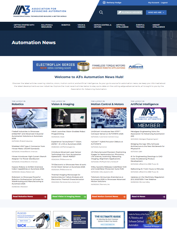
More content had created more choices, but not more clarity.
Everything competed equally.
Without a strong editorial hierarchy, visitors had little guidance about what deserved their attention first.
Formats felt disconnected.
Articles, video, podcasts and market intelligence felt like separate destinations rather than parts of one content ecosystem.
Discovery required too much effort.
Visitors often needed to know what they wanted before arriving instead of being naturally led toward relevant content.
The interface undersold the content.
The visual experience didn't communicate the depth, variety or authority of the information A3 was already producing.
Don't make people browse a database.
Help them discover what matters.
Build the hierarchy first.
Let the interface make it visible.
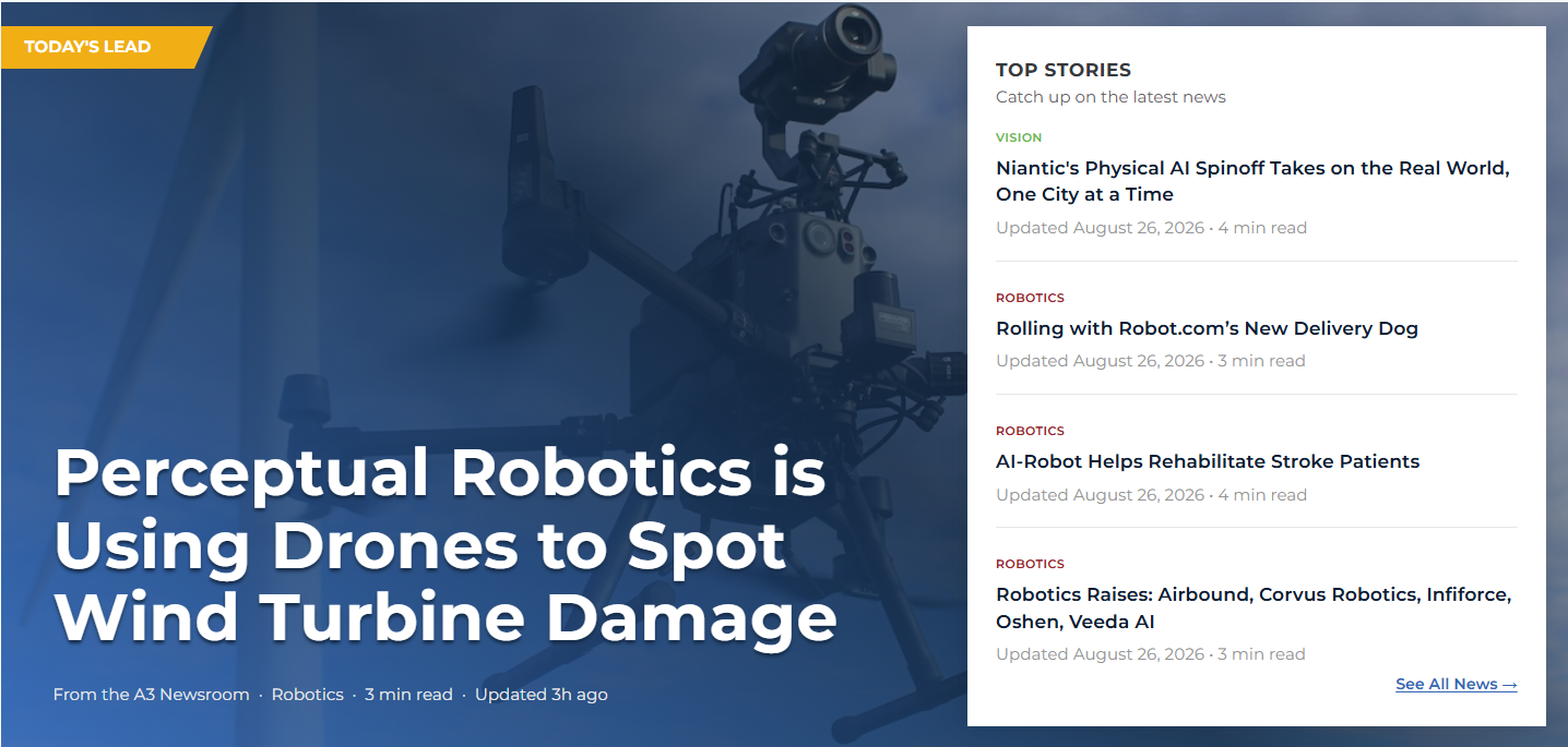
Give every screen a clear starting point.
A lead story establishes priority immediately. Supporting stories remain visible without competing at the same level, allowing editorial hierarchy to do some of the navigation work.
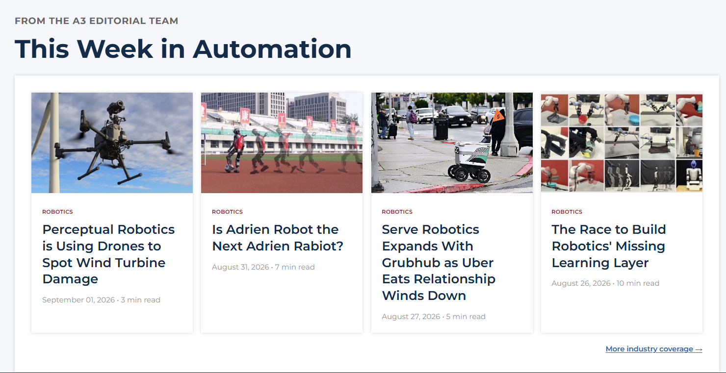
Turn browsing into continued discovery.
Recurring editorial modules create new entry points as people move through the page. The experience can surface timely coverage without collapsing back into one endless chronological feed.
Connected doesn't have to mean identical.

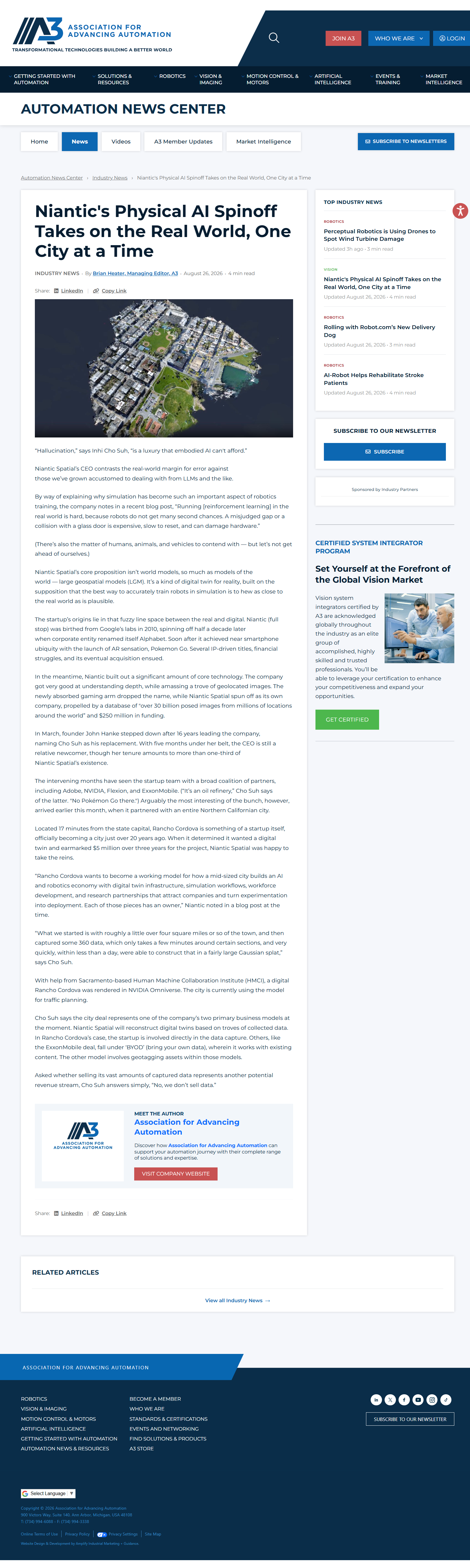
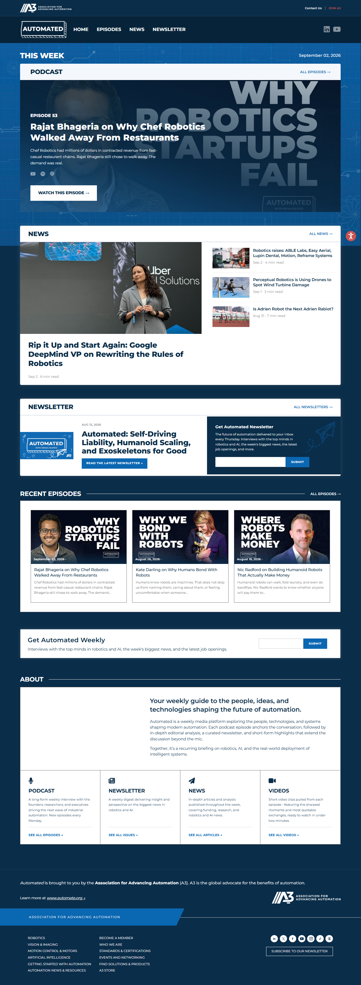
Designed to collapse.
Not just shrink.
On smaller screens, horizontal relationships disappear. That means hierarchy has to become sequence: what comes first, what follows and what still deserves emphasis when everything stacks into one column.


A content problem can look like
a design problem.
It usually isn't.
The visual redesign mattered because the structure underneath it changed first. Once the content had hierarchy, relationships and clearer pathways, the interface could finally make those decisions visible.
BETHANY
HODGE
DIGITAL EXPERIENCE + DESIGN
UX, web design, information architecture,
design systems and creative direction.
Ann Arbor, Michigan.