OHIO
AUTOMATION
TRAINING
The opportunity was simple.
Getting there needed to be, too.
I designed a new digital experience for an Ohio-funded automation training program—turning eligibility, funding, course options and registration into a clearer path for prospective learners.
VIEW LIVE EXPERIENCE ↗Make a complicated program feel straightforward without removing the information people actually need.
Explain the opportunity.
Visitors needed to understand the value of the program before learning the mechanics behind it.
Help people self-select.
Eligibility, audience needs and course options had to become understandable choices rather than a wall of program information.
Keep the next step visible.
Every section needed to support the journey toward choosing a course and registering.
A valuable program came with a lot to explain.
A3 and Mahoning County Career & Technical Center partnered to provide selected online automation training to eligible Ohio residents through Ohio's Individual Microcredential Assistance Program.
The value proposition was strong: practical, industry-recognized training available at no cost to eligible participants.
But before someone could register, the experience still needed to communicate eligibility, funding, available training, course selection and the registration process. The challenge was not removing that complexity. It was making it easier to move through.
Useful information can still become friction.
Explain the offer quickly.
Visitors needed to immediately understand that the training was online, industry-recognized and available at no cost to eligible Ohio residents.
Support different audiences.
Students, working professionals and employers could all benefit from the program for very different reasons.
Keep the next step obvious.
Eligibility, course selection and registration could easily become a maze if every piece of information competed for equal attention.
Complex program.
Simple decisions.
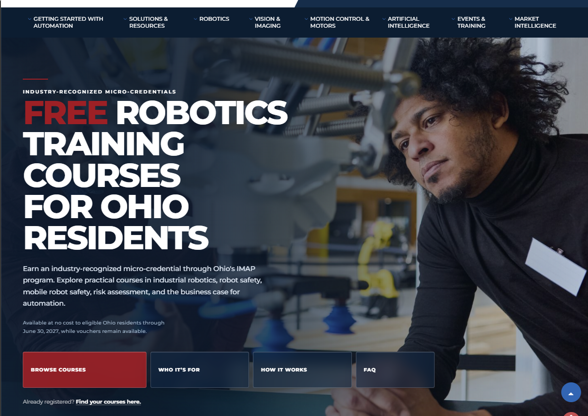
Lead with the opportunity.
The experience opens with the benefit someone actually cares about—free robotics and automation training for eligible Ohio residents—before asking them to understand funding structures, partner organizations or program mechanics.
Understand the offer
See who it's for
Understand how it works
Choose a course
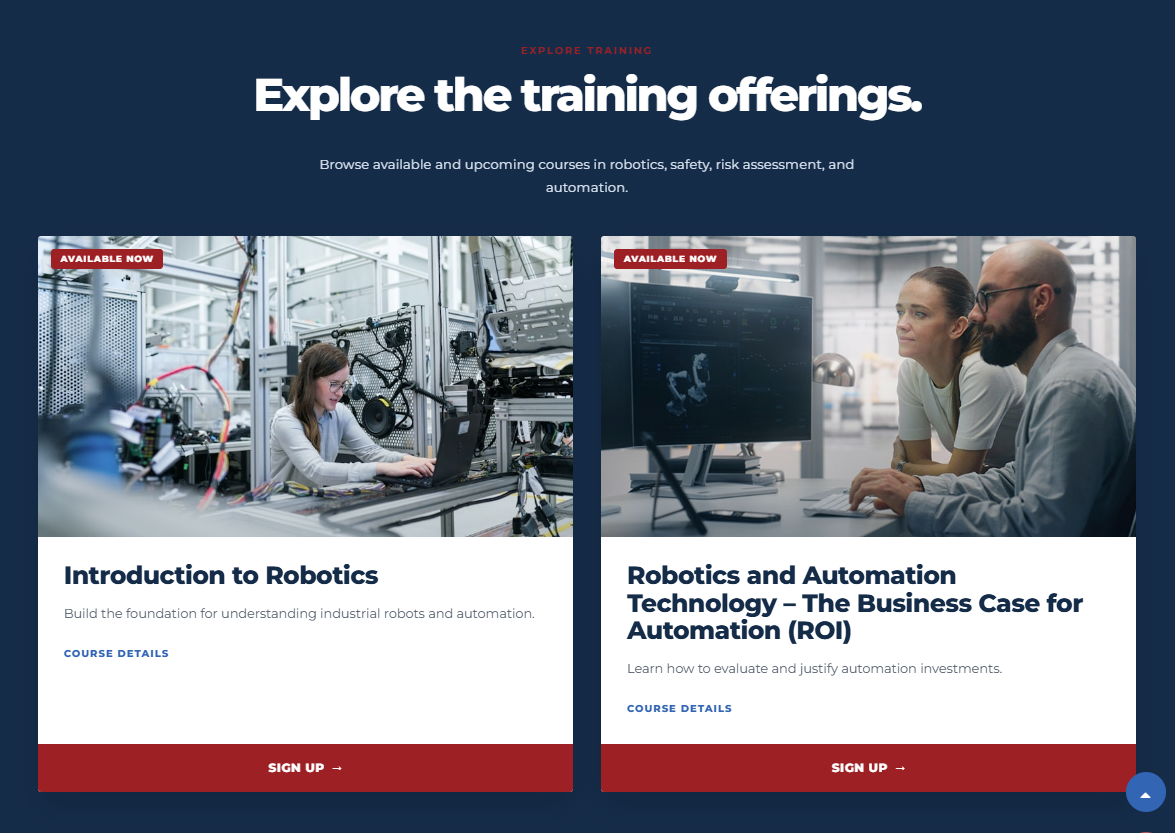
Turn training into choices.
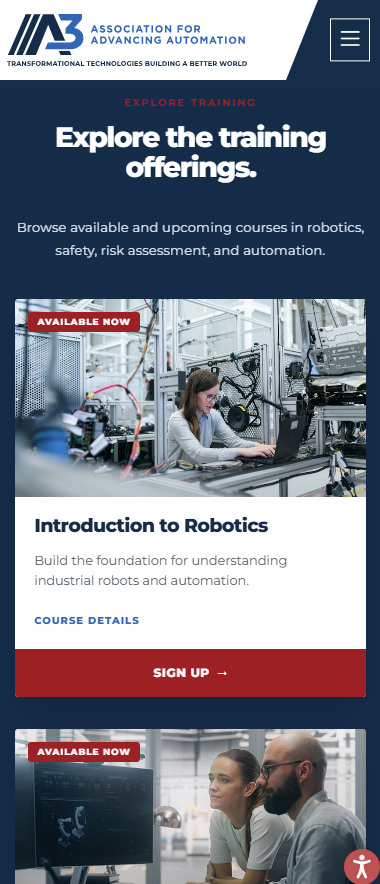
Rather than presenting the available courses as a long catalog, I used distinct cards with status, imagery, plain-language descriptions and consistent calls to action so visitors could compare their options quickly.
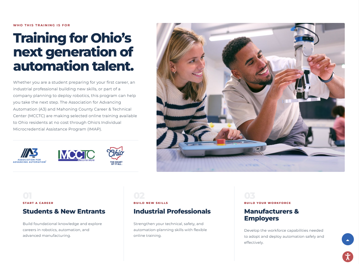
One program. Three reasons to care.
The program served more than one kind of learner. Instead of flattening everyone into a generic audience, the experience gave students, professionals and employers distinct reasons to recognize the opportunity as relevant.
Not everyone visiting the page needs to register.
Most of the experience helps a prospective learner understand the program and move toward registration.
Someone who has already registered arrives with a completely different goal: get back to their training.
Giving that person a direct route avoids forcing a returning learner back through an acquisition journey they have already completed.
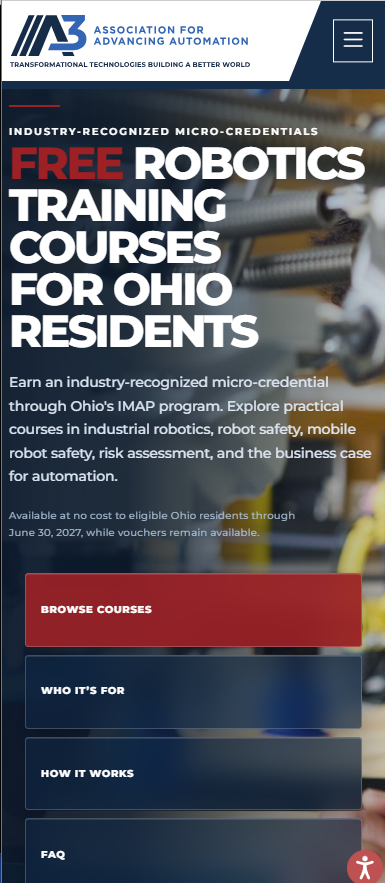
The pathway had to survive the smaller screen.
Mobile wasn't simply a compressed desktop layout. The hierarchy becomes a deliberate vertical sequence: understand the offer, choose where to go and then move into the training options without losing the distinction between information and action.
Make the program easier to act on.
Faster orientation.
The hero communicates the core offer immediately without requiring visitors to decode the funding program before understanding the benefit.
Clearer self-selection.
Audience messaging and course structure help visitors determine whether the program is relevant and which path makes sense for them.
Less cognitive load.
Program mechanics remain available, but they no longer compete with the primary decisions someone needs to make.
Different paths for different states.
Prospective learners and returning registrants are given different routes instead of being treated like the same user.
The program didn't need to become simpler.
The experience of understanding it did.
Good UX doesn't remove necessary information. It decides when that information matters, what needs to come first and how to help someone move from understanding an opportunity to acting on it.
BETHANY
HODGE
DIGITAL EXPERIENCE + DESIGN
UX, web design, information architecture,
design systems and creative direction.
Ann Arbor, Michigan.