A3
TRAINING
EXPERIENCE
A lot of learning options.
One place to understand them.
I redesigned A3's training experience to bring certifications, live safety training, on-demand courses, webinars and industry events into a clearer learning ecosystem built around how people actually explore professional development.
The problem wasn't a lack of training. It was understanding the ecosystem.
A3 offers multiple kinds of professional development: live robot safety training, self-paced courses, certification pathways, technical webinars and industry events.
Those offerings serve different audiences, happen on different schedules and require different levels of commitment.
The experience needed to help someone orient themselves before asking them to compare individual courses, dates or credentials.
More options only help when people can tell what the options mean.
Different learning modes.
Live courses, self-paced training, certifications, webinars and events each require different decisions from the learner.
Permanent and timely content.
Core learning pathways needed to coexist with new course launches, upcoming sessions and other time-sensitive opportunities.
Too many valid next steps.
The page couldn't rely on one primary call to action. Different people needed different routes depending on what they were trying to learn.
Don't start with the catalog.
Start with the pathways.
Give people a way to orient themselves first.
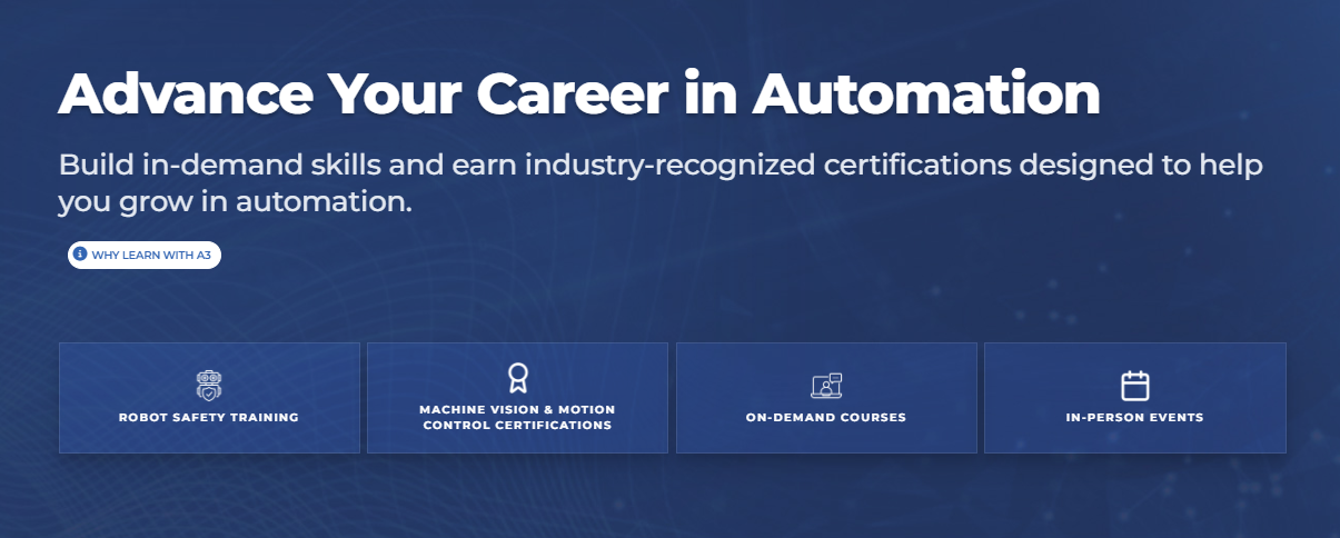
The top of the experience introduces four major learning paths—robot safety training, certification, on-demand courses and in-person events—before asking visitors to choose an individual program.
Separate what's current from what's permanent.
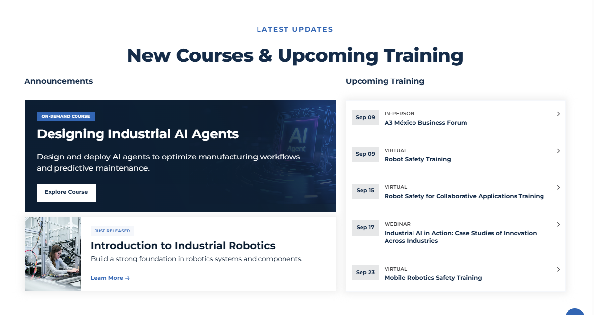
New courses and upcoming training need stronger urgency than evergreen learning pathways. A dedicated updates section gives timely opportunities visibility without turning the entire page into a chronological feed.
Turn related courses into a recognizable learning family.
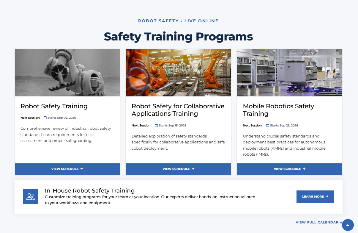
Robot safety training isn't one product. It is a related group of learning options serving different environments and applications. Presenting the programs together makes comparison easier while reinforcing the broader pathway.
A hub, not a giant list.
The complete experience creates a rhythm between orientation, timely opportunities, specialized training, certification, webinars, industry events and direct support. Each section does a different job while still belonging to one learning system.

Make a broad learning ecosystem easier to navigate.
Faster orientation.
Visitors can identify the major learning paths before digging into individual courses, dates or credentials.
Better discovery.
Related training, webinars, certification and events are surfaced as parts of one ecosystem instead of isolated offerings.
Clearer prioritization.
Timely updates can receive stronger emphasis without overwhelming the permanent learning structure.
More useful choice.
Instead of presenting every offering at the same level, the interface helps people understand what kind of learning they need first.
Training isn't easier to navigate because
there are fewer options.
It's easier because the options make sense.
BETHANY
HODGE
DIGITAL EXPERIENCE + DESIGN
UX, web design, information architecture,
design systems and creative direction.
Ann Arbor, Michigan.